Launching Betterment Checking
The launch of Betterment Checking and its first debit card marked a bold step for the brand, blending sleek design with innovative features. From crafting a debit card that embodied trust and excitement to building a campaign that sparked FOMO, this launch set the tone for a new chapter at Betterment.
Designing the card
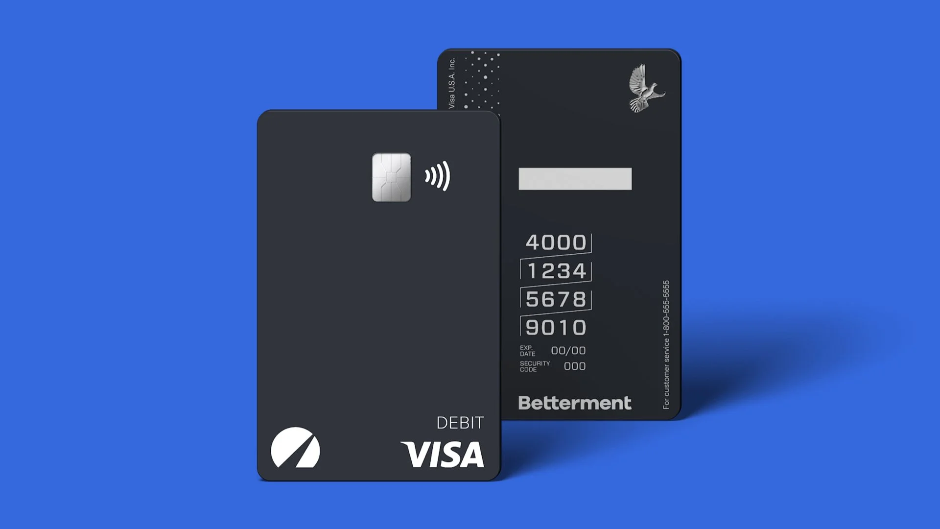
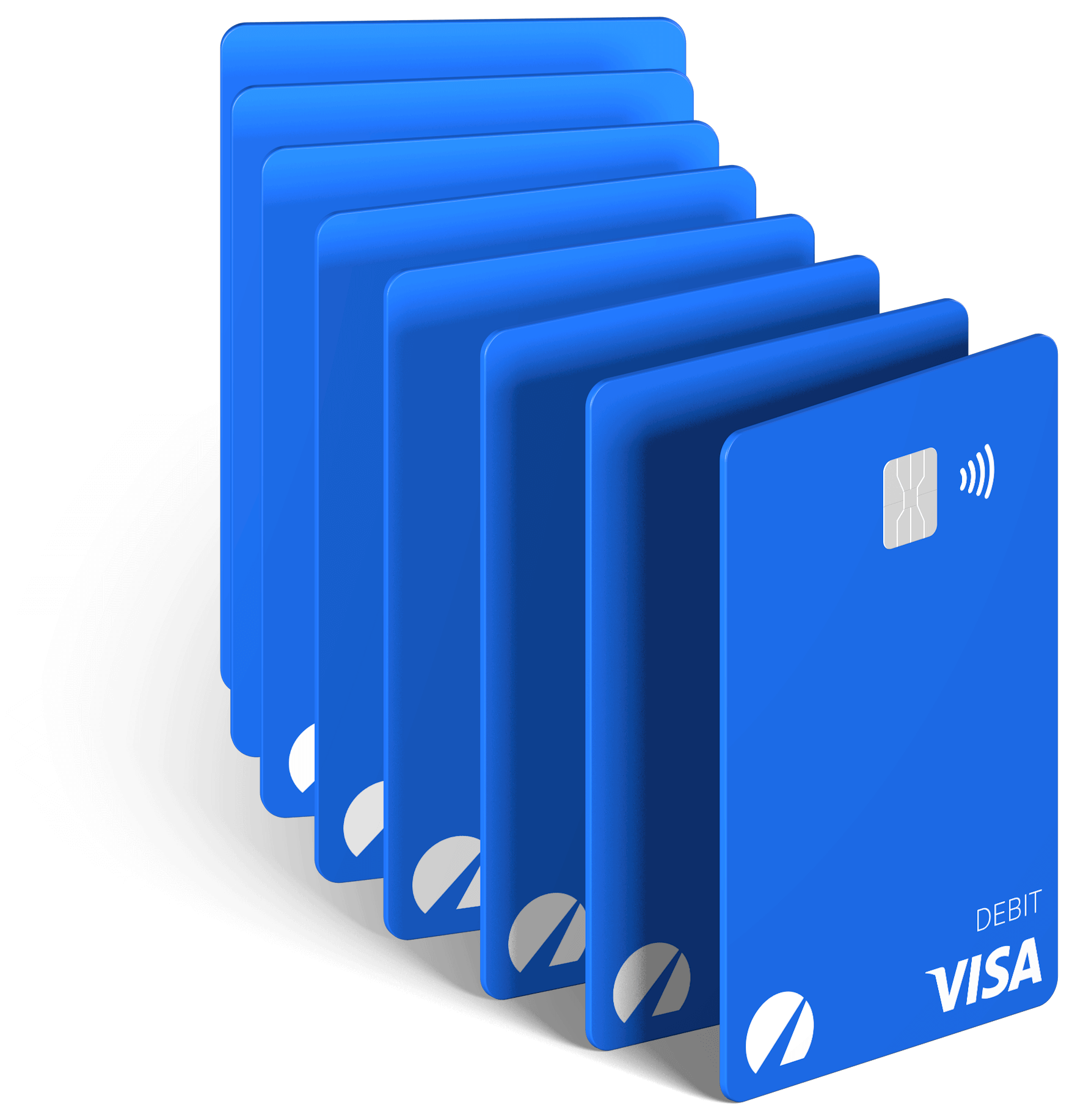
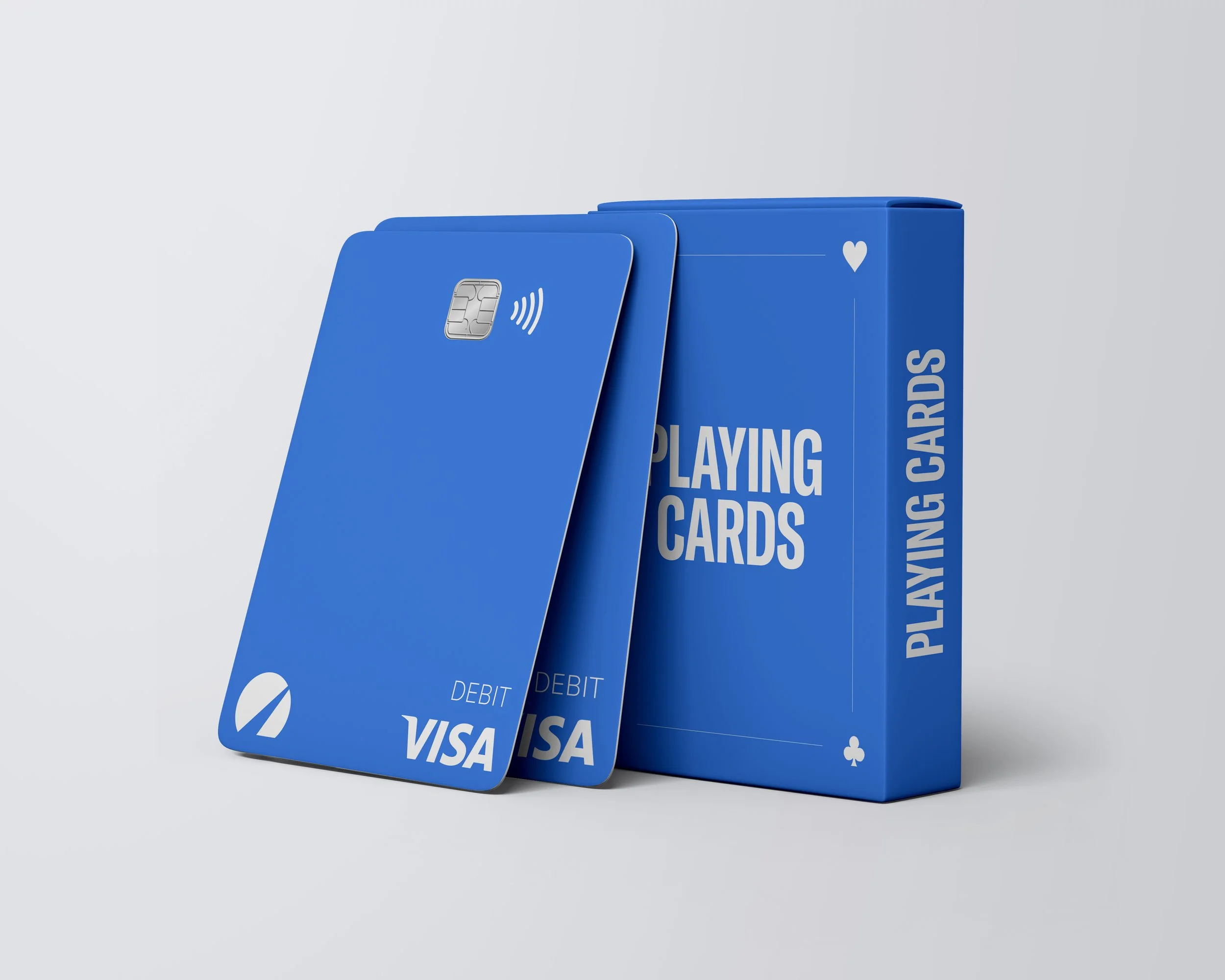
The Betterment debit card needed to embody the values of the Checking product: exclusive, trusted, and innovative. We designed a card that balanced sophistication with approachability, using a limited color palette of Betterment blue and charcoal gray. More than just a functional product, the card became the visual centerpiece of the campaign. Its clean design set the tone for all supporting assets, establishing a cohesive visual language that balanced trust, innovation, and excitement.
Building anticipation for
the Limited Edition card
The campaign’s first phase was all about generating buzz, and we knew exclusivity was the key. Enter the Limited Edition debit card: a sleek, charcoal-gray design that became the ultimate must-have for Betterment superfans. This card wasn’t just a functional product—it was a statement, sparking FOMO and excitement. Loyal customers were invited to join the waitlist and spread the word.
Crafting the
physical mailer
Every detail of the packaging was crafted to create a sense of exclusivity and excitement. The packaging was designed to surprise and delight customers while reinforcing Betterment’s trusted and modern identity. By combining thoughtful design with premium materials, the packaging enhanced the overall experience and reflected Betterment’s customer-centric ethos. With the card and packaging finalized, the next step was to build anticipation for its release.
Launch the campaign
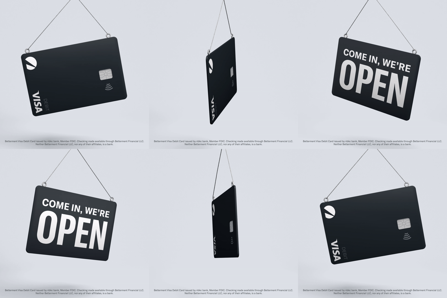
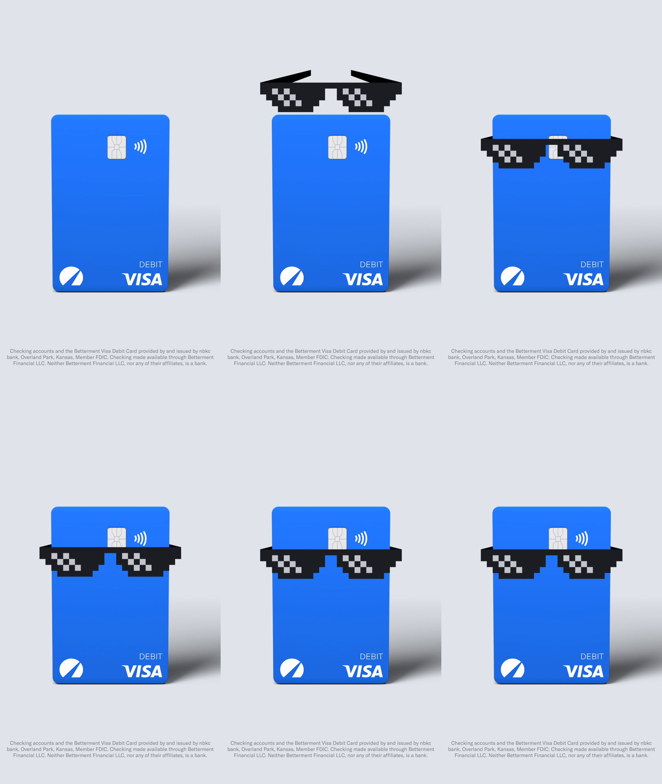
For the public launch, we wanted to create a campaign that didn’t just inform—it delighted. Our goal was to make people smile with marketing that felt fresh, relatable, and a little unexpected. Drawing inspiration from memes and pop culture, we designed playful visuals and animations that highlighted the product’s features in a fun and engaging way.
From a nod to classic "deal with it" sunglasses to nostalgic visual cues, the campaign leaned into humor while staying modern. This touch of lightheartedness helped balance the serious nature of financial products, reinforcing Betterment’s innovative and human-centered brand identity.
Why it works
Excitement and magic
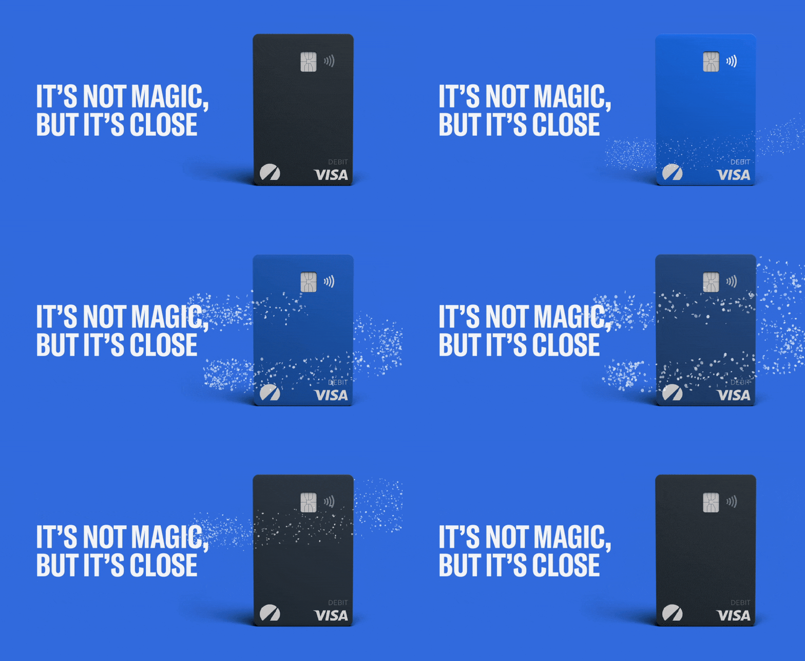
By incorporating dynamic animations and playful visuals, the campaign captured the excitement of the launch while adding a touch of magic to the customer experience. This approach made the campaign feel fun and engaging without losing its credibility.
Cohesion across touchpoints
From packaging to social media to in-app experiences, the design system ensured a consistent and cohesive customer journey. This alignment amplified the campaign’s impact and established Betterment Checking as a standout product in the fintech space.
Sleek and trusted design
The limited color palette of charcoal gray and bright blue created a sleek and modern look that balanced sophistication with boldness. Every element, from the Limited Edition card to the marketing assets, reinforced Betterment’s reputation as a trusted and innovative brand.

