Cocomo Brand Design
Born in New York City, Cocomo is a premium coconut lotion. We designed a visual identity that captures the city’s energy and the lotion’s luxurious feel. Cocomo brand ethos bridges two worlds: the gritty sophistication of NYC and the breezy indulgence of tropical beaches. With a non-greasy, lightweight formula, Cocomo invites you to spread the love—whether in the city or by the shore.

Designing the identity
Cocomo’s identity reflects its duality, with a logo that pairs the flowing, delicate lines of a script font with a subtle roughness that nods to the brand’s NYC roots.
A carefully selected color palette balances warm, sandy neutrals with bold tropical hues, offering a harmonious contrast that feels fresh and grounded.
The typographic choices amplify this juxtaposition. Beatrice Display, with its contrasting thicks and thins, is paired with the sharp intensity of Blakely Slab.


Photography reinforces this aesthetic with gritty, authentic visuals of NYC’s bustling streets paired with calming, natural scenes of the beach. The images avoid overly polished or saturated tones, creating a grounded, striking visual system.


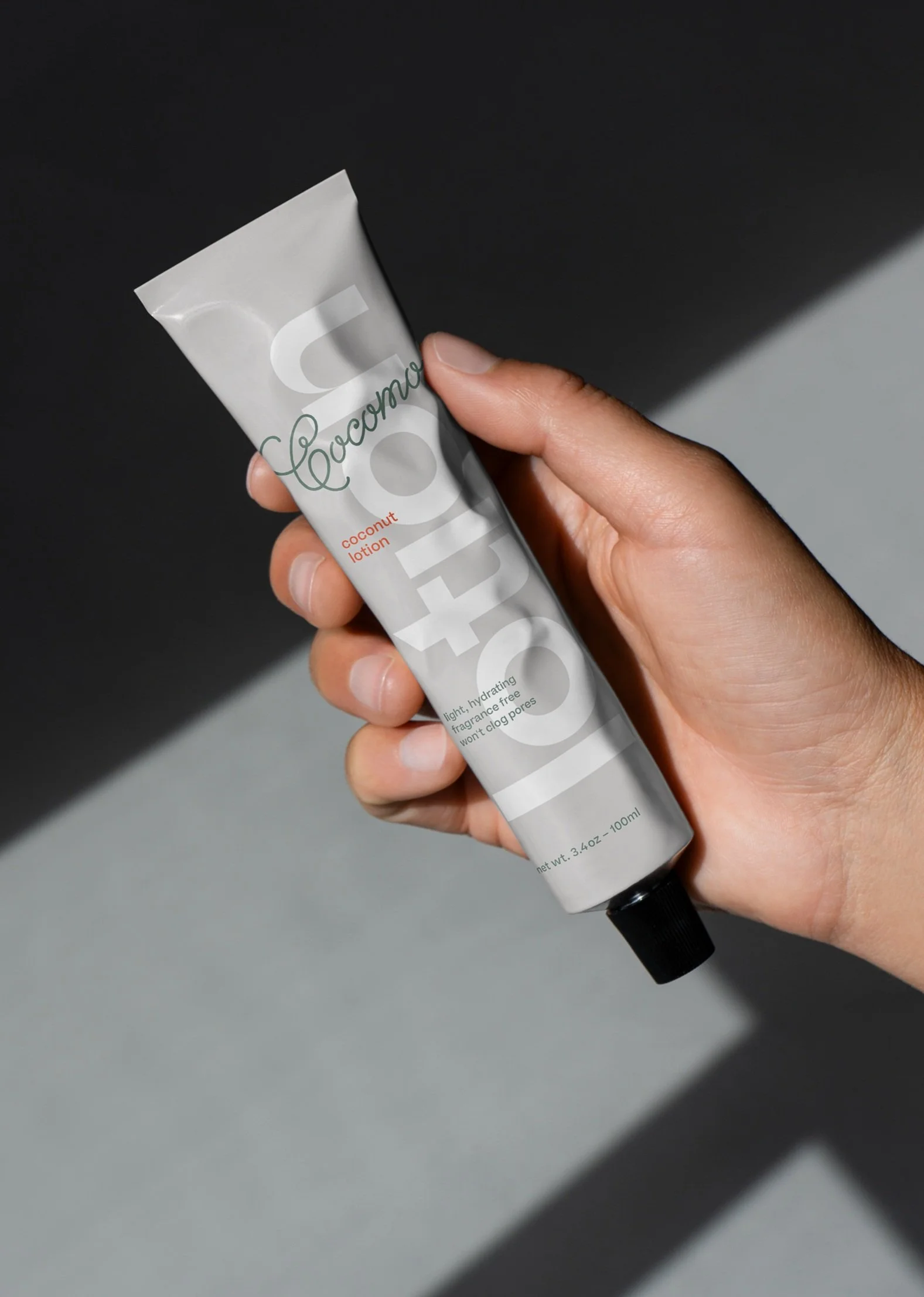
Packaging the experience
The packaging design channels bold typographic choices to create a sophisticated yet approachable aesthetic. High-quality finishes like embossed textures and matte surfaces add a tactile, premium feel, while subtle color accents reflect Cocomo’s tropical roots. It’s a packaging design that feels as confident and dynamic as the city it’s inspired by.


Expanding the brand
From the website design to social media, the refined visual system ensured consistency and sharpness across every touchpoint. The brand’s signature NYC-edgy tone paired with its breezy indulgence made Cocomo stand out as a bold yet approachable brand.
To extend Cocomo’s identity, we designed striking swag, including a tote bag that exudes effortless cool. We even had fun imagining how the brand might live on unexpected items like surfboards or pool floats—finding new ways to bring urban sophistication and tropical vibes together.


Why it works
Cohesion across every touchpoint
From packaging to social media, every element of Cocomo’s design works together seamlessly. The sharp typography and moody, unposed photography unify the brand across digital and physical platforms, creating an unmistakable identity.
A fresh and unexpected combination
Blending the grit of NYC with the breezy vibes of a tropical getaway creates a brand identity that feels entirely fresh. This contrast is what makes Cocomo memorable—luxurious without being exclusive, approachable without losing its edge.
A bold and balanced identity
Cocomo strikes the perfect balance between urban sophistication and tropical indulgence. The bold typography and warm, beach-inspired colors create a look that’s both dynamic and grounded, standing out in a crowded market.
Designed in collaboration with David Balsamello
← Home